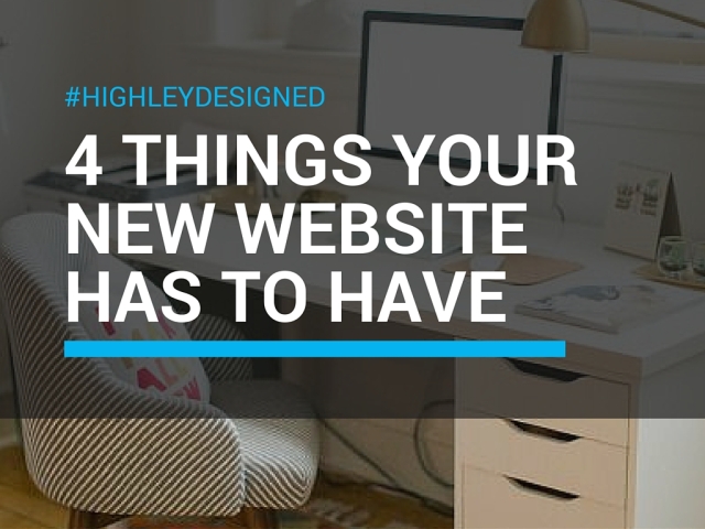
I recently launched my new website, highleydesigned.com. It’s a simple site to give people more information about my business and my services. It includes a recent projects page which is like an online portfolio and most importantly it features my blog!
As I was designing my site and working on layouts and themes I realized there are a million things to consider, but I was most concerned about a handful of important features.
- Make Sure Your Contact Information is Easy to Find
This is one of the biggest reasons people come to your website – because they want to learn more about you or get in touch with you! Too often I visit websites that bury their contact info or the only way to get in touch is through an email contact form.Make yourself approachable! Let people know you are happy to take their calls or it’s easy to set up an appointment etc. I recommend a phone number in your header and full contact info in your footer (phone and address). Your contact page should include all of that along with a map so people can see where you’re located and that’s where you can add your fax number, email address and other additional information.An email contact form is great to have because it makes it easy to track who’s contacting you via your website, but if someone wants to send you a long message or add attachments it’s often easier for them to send an email from their own account. For this reason I include an email address on my website, but if you find you’re receiving too much spam you can always remove it.
- Make Sure Your Site Features Responsive Design
Responsive design means your website is mobile friendly. The term responsive highlights your site’s ability to respond to any device. Take Facebook for example – it looks different on mobile, tablet and desktop. Amazon is similar, and like Facebook, it’s become so popular they developed a mobile app to make it even more accessible.Google has announced that with its newest algorithm responsive design will play a major part so it’s important your website is mobile friendly. You don’t have to write html code to make sure your site is mobile friendly. Try using a visual editor to design your site like Duda. Duda offers beautiful responsive websites at a great price. - Make Sure Your Site Offers High Quality Content
When you have a great website the biggest mistake you can make is to fill it with mediocre content, poor copy writing or generic headlines. If you don’t have someone in-house to do your writing, hire someone with experience. A professional can make your website sound as good as it looks.Pay special attention to your site headlines and make sure to avoid cliches. When it comes to your content make sure you portray yourself or your brand as a voice of authority in your industry. You want people to know your an expert in your field that can be trusted. And when it comes to your blog or your site’s original articles – don’t share something that’s been shared a million times unless you can add a fresh perspective. Remember to be original! - Make Sure to Use High Quality Photos
The photos on your website speak to your brand’s professionalism and can either say “high quality” or “yikes they actually put that on their website!” This may mean spending money on stock photos or hiring a photographer – either way, you’ll be glad you did.Make sure your photos are bright and look cohesive. For example if you have a page with staff photos make sure they are all taken with the same backdrop, or if your site features products make sure they all have a transparent or white background.


 highleydesigned